The Shape of Things to Come

The 3.5in x 2in rectangle is tried and true, but it’s worth reconsidering if a different shape may better communicate your business – and make an even bigger impact.

La Charcuterie, a gourmet deli and restaurant in Vancouver, uses circular cards that resemble slices of salami. Brilliant!

La Charcuterie Business Cards

One drawback to the circular card concept, however, is holding it. It surely won’t get lost in a stack of traditional cards, but it also won’t fit in a traditional card holder or wallet. Depending on your business, this may or may not be a big problem, but there may be a solution. The cards below fold and tear, respectively, to help them travel a bit easier with their rectangular companions.

Round Business Cards

Other cards can take shapes of their own that still fit within the traditional dimensions using simple die-cuts.

Die-Cut Business Cards

(Clockwise: Michela Schirinzi, Counter Creatives, Mineral Spring Water, Pop Grub)

The Catalog Comeback

Though e-commerce makes up just a fraction of total retail sales, that fraction is steadily and rapidly increasing – online business is booming, we know this. But what you may not know is that printed catalogs are one of the most influential sources for information when making online purchases. Print catalogs are even more influential in driving online sales than some online channels.

Why print?

According to Sarah Knup, head of strategy and marketing at childrenswear brand Tea Collection, “We see the catalog as more relevant as a true storytelling and brand piece… You don’t get the same feeling when you’re flipping through a PDF.” Catalogs are making a comeback, with many retailers increasing their catalog spend. Even online-only retailers are beginning to mail catalogs of their own. The investment is a wise one – research by the US Postal Service shows that online shoppers who receive a catalog piece spend 28% more than those who don’t.

Just take a look at Zappos Life. Though Zappos is an online-based retailer, per-transaction sales from its catalog are twice that of the website.

Zappos Life

How Color Affects Your Brand

A study of the world’s top 100 brands revealed that blue is the most popular color (33%) for a brand’s logo. Why? If you ask Mark Zuckerburg, he chose the color for Facebook because he is red-green color blind. Of course, that’s probably not why it’s the most popular color for brand logos worldwide… Research has shown that color influences 60-80% of purchasing decisions.

Blue
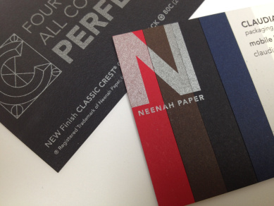
The color(s) you use to communicate become an identifiable part of your brand. Though some color associations vary culturally, blue is typically symbolic of trust, dependability, security, responsibility, and credibility; it’s also considered to be tranquil and professional. Some color choices are better than others depending on your industry – for example, blue is very popular for corporate, technology, and financial brands.

Red is another popular color (29%) that conveys very different feelings, associated with energy, intensity, and excitement – think Virgin, Target, Budweiser, Coca-Cola. A combination of red and blue conveys something else altogether: patriotism.

Other colors and their general associations:

Orange: warmth, energy, enthusiasm
Yellow: optimism, energy, creativity
Green: nature, peace, wealth
Purple: sophistication, creativity, spirituality
Black: prestige, sophistication, power
Grey: balance, conservatism, seriousness
White: purity, cleanliness, softness

There’s Something About Print

There is something about having that large expanse of real estate in your lap, something about the format, that is extremely satisfying… Having many different things you may be interested in on a page, as opposed to a single thing surrounded by ads as it is on the web, leads to the formation of different connections and leads to a different experience.

Cool ToolsThat’s Kevin Kelly of Wired describing just some of the value of his recently printed book Cool Tools. The book was just published in December, but Cool Tools isn’t new – the website has been actively collecting curated reviews of tools for 10 years. Now, Kelly has taken 1,500 reviews from the website and created an over-sized 472-page book that retails for $39.99.

It sounds like a strange idea – and maybe it is – but it worked. The first printing sold out immediately. The reviews are glowing, and as one Amazon reviewer explained: “Yes, you’ve already read (or could read) much of the content on the site, but the book format (and the fact this is a hand-picked subset of the reviews from the blog) adds context and flow… It is a nicely realized, physical thing.”

Image via Joel Arbaje for Fast Company.

Why Font Matters

WritingPresentation is crucial to all forms of communication, especially when dealing with written communication. Unlike information conveyed personally, a printed message is static. It must speak for itself.

Superb content is not enough. To achieve truly effective communication, one must pay equal attention to how the content is presented. Style can, and often does, override substance. And basically, the fundamental element of printed communication is font.

Put simply, font is the style of your typeface. When utilized well, a font or font mix accomplishes four things: 1) focuses attention 2) enhances readability 3) sets a tone and 4) projects an image. Font is your first line of defense against reader apathy — and your first chance to really capture an audience, create a positive and lasting impression, and encourage continued interest.

While there aren’t any set-in-stone rules for font choice (except, you know, this one), below is a brief digest of some useful font guidelines:

Serif vs. Sans Serif
Serif fonts are best for print, especially large amounts of text, as the additional “strokes” they are named for allow readers to differentiate the letters more clearly. Sans Serif fonts are simple and eye-catching — best reserved for headlines. Stamping or embossing? We recommend a sans serif. For now, why not test your knowledge here?

Watch Your Case
Use upper and lower case text for the body of your work. Avoid using all upper or lower case text, as both can be difficult to read. As for headings and titles, use upper case lettering whenever prescribed or necessary.

Size Matters
Generally accepted writing guidelines prescribe the use of 10-12 point font for the body, 14-48 point font for primary headings, and one-half of the primary heading point size for secondary headings. A warning though: font on your computer screen may appear larger than it actually is. If you err, err on the large side. Remember, if your text is too small to read, it simply won’t get read.

Keep It Simple
Simplicity is a virtue in writing and font is supposed to enhance your message, not sabotage it. Unless it is truly warranted, tend toward simple, inconspicuous fonts like Times New Roman – this fonts, among others, is TrueType—this means that what you see on the screen is exactly what you will see on the page.

Be Consistent
As a general rule, don’t use more than two fonts in the same piece and be consistent throughout the document.

Use Variety When Needed
Although font use should be consistent throughout a project, variety is sometimes needed to break the monotony. One good way to infuse diversity into a document is via the use of italicized, bold, or underlined text to signal importance, emphasis, even inflection.

Curb the Clutter With Direct Mail

Given the avalanche of marketing messages we’re exposed to on a daily basis, it stands to reason that authentic, engaging messages are more likely to get a response. Most messages go virtually unnoticed, skimmed or purposely ignored – no one’s looking for the needle in the haystack. And why should they?

Marketing Clutter by Tom FishburneRather than expect your customer to notice you amidst the clutter, do something that stands out… easier said than done, I know. But believe it or not, some of the most engaging messages are the simplest.

If you haven’t seen PRINTISBIG.com, take a look:

Print is an effective and important tool you should never forget… While the digital marketing space has gotten noisier and considerably less effective, print has enjoyed a renaissance of increased conversion rates and marketing return on investment. Customers actually appreciate getting a nice postcard, well-designed catalog, or personal thank you note in the mail today.

According to the stats, US advertisers can see a 1300% ROI on direct mail, and direct mail is responsible for an incredible 78% of donations for non-profits. It makes sense if you consider that 80% of households read or browse their direct mail (yes, 80%!). And according to the USPS, shoppers who receive direct mail actually spend more than those who don’t.

Cartoon by Tom Fishburne.

Business Cards: Small & Mighty

Neenah Paper Business CardsWhile most methods of communication have gone digital, the traditional business card is proving to be surprisingly resilient. What originated in the 17th century as a method of announcing visitors has held its own to the tech-heavy present-day – but why?

Though a business card is tangible, it also has a number of intangible benefits. As the Boston Globe suggests, “Entrepreneurs who must fight to be taken seriously by prospective customers and investors talk about the sense of legitimacy they get from seeing their names and titles printed on quality card stock. They say that in the startup world — where businesses often don’t last long — it’s nice to hold something that feels kind of permanent.” Similarly, Print Media Centr’s Sandy Hubbard notes, “a printed business card still conveys credibility.”

In a way, business cards have also evolved to present more than just names and numbers. Graphic designer John Date refers to the exchange of business cards as “an experience… It’s become much more of a portfolio piece then it was in the past.”

A few things to consider in designing your next business cards:

Content
Name, company, title… there are a lot of pieces of information you could include on a business card, but stick with the most valuable. What’s the best way to get in touch with you? Do you even use a fax machine? Choose the information you most want to share. If you include too much text, it may become difficult to read.

Font
Once you know what text you want to include, think about what kind of typeface would be best to present it. Choose a font that is readable and matches the tone of you and your business.

Paper
Paper comes in a variety of finishes – smooth finish is typically the most popular. Of course, almost anything is possible. If it works for your business, you don’t even have to print on paper, nor do you have to stick to the traditional 3.5in x 2in size and shape.

Design Elements
You’ll likely want to include your logo on your card. How much card real estate will you devote to it? What color is it? What font is it? Make sure your logo is identifiable and works well with the font you’re using for the rest of your content. If you choose to use a color on your cards – or print on colored paper – make sure you choose a color that suits your logo and text and is still easy to read.

Image of Neenah Paper business card via Fey Printing.

Brochures: Power in Your Pocket

Brochures are possibly the most flexible and hard-working of your marketing collateral. They can help initiate a sale or close one; they can be sent in the mail or handed out face-to-face. As John Treace wrote for Inc., “One of the biggest sales I ever made was initiated in an elevator with a brochure that I happened to have in my pocket.”

To showcase a configurable furniture collection, Miller Brooks created this brochure for Kimball Office.

Kimball Office, Miller Brooks

This brochure for TVNZ 7 (Television New Zealand) literally unfolds to form the brand’s “7” logo.
TVNZ7 Brochure

Audi’s engaging centennial piece, when ripped open, features a timeline of the brand’s history.

Audi Brochure

To celebrate Pratt Institute’s 125th anniversary, this brochure includes die-cut pop-ups of iconic artists and their designs.

Pratt Institute